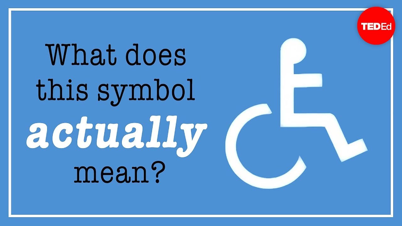
What does this symbol actually mean? - Adrian Treharne
Some of the world's most recognizable
symbols exist to sell products,
others to steer traffic
or advance political causes.
But there's one whose main purpose
is to help people.
You may know it as the wheelchair symbol,
or a sign for people with disabilities,
but its formal title as maintained
by the ISO
is the International Symbol of Access.
But despite its familiarity,
many people are unclear as to what
the symbol actually means,
which has a lot to do with the symbol
itself and the way it came about.
In 1968, the International Commission
on Technology and Accessibility
held a design contest.
They were looking for a symbol
that would be readily identifiable
from a reasonable distance,
self-descriptive,
simple,
practical,
and couldn't be confused
with existing signage.
The winning design,
which didn't have a head,
was created by a Danish designer
named Susanne Koefed.
The addition of a head a year later
gave it a more human form,
and within ten years,
it was endorsed by both the United Nations
and the ISO.
With minimal cost and minimal fuss,
a global icon was born.
There have been a few tweaks
over the decades.
The Graphic Artists Guild added more
rounded, human-like features,
and in 2012, the Accessible Icon Project
produced a more dynamic version.
But what does it really represent?
What's its purpose?
Put simply, it's a sign to identify where
there are accessible facilities.
The strength of such an internationally
recognized image
is that wherever you travel,
you don't need to speak the language
or have in-depth cultural knowledge.
If you require an accessible toilet,
the sign shows the way.
But the confusion comes
from the term accessibility
and what that actually means.
Many people assume that because
the symbol depicts a wheelchair,
that accessible facilities are meant
only for people who use wheelchairs,
or those, at the very least,
who have a visible physical condition.
But accessibility is a broad concept
that applies to many,
many different conditions.
That includes people with autism,
visual impairments,
and autoimmune diseases,
like lupus, which can cause
pain and fatigue,
along with many other conditions.
In fact, the World Health
Organization estimates
that there are approximately
1 billion people
who experience some form of disability,
which means that this group is very
likely to include yourself,
or a family member,
a classmate,
a friend,
or a work colleague.
And people who use wheelchairs only
make up about 65 million,
or 15% of the total.
The vast majority
have non-visible disabilities.
Accessible parking spaces, facilities,
and entrances
are designed with
that entire group in mind.
So it's easy to see why in recent years
people have begun to raise questions
about whether the symbol is really
appropriate for what it's meant to do.
And it's not just about accuracy.
It's common for people
to become indignant,
sometimes abusive,
when they see people without visible
disabilities using accessible facilities.
The symbol is unfortunately creating
widespread issues
for the very people and families
it's meant to help.
The recent redesigns have attempted
with some success
to acknowledge concerns
over the current symbol.
But some think that a complete redesign
is in order.
It's a difficult task, though.
How do you replace a symbol
that's familiar the world over?
And what do you replace it with?